Tuesday, 28 March 2017
Final idea: Magazine cover
Final choice on outline
My final decision was to go with picture 1, as previously stated. With the overall layout of the magazine cover I have decided to stick most closely to the cover of "Sight & Sound." This is because this a more low-key, less clustered magazine, which I feel will help my magazine cover and make it seem more authentic (as opposed to trying to mimic a cover of a best selling magazine).
I am going to use most of the conventions that are typically found on magazine covers, such as the coverlines, the strapline and the masthead. This, again, is to make the magazine cover seem as authentic as possible.
Tuesday, 14 March 2017
Planning magazine cover: Initial ideas
Conventions that I will use
For my own magazine cover, I will make use of some of the main magazine cover conventions. This will include a main image, a masthead, cover lines, strapline, and barcode/issue number. Like the poster, I want to stick to these conventions as best I can to make the movie poster as realistic as possible, and to make it seem realistic. Despite sticking to these main conventions, I will try not to have too many coverlines to avoid the magazine cover seeming too clustered. This is to show that the magazine is not a widely marketed one and is instead a smaller, independent film magazine, which I want to convey in my cover.
Initial ideas
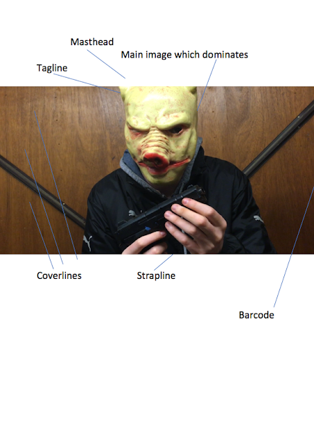
I want my magazine cover to again depict the villain, so the genre can be easily identified again. I am considering using picture 1 this time, as I feel it will be appropriate for a magazine cover, as, like the second picture, it presents the villain as threatening and menacing (reinforced this time by the gun in his hands). The picture will be eye-catching, which will conform to the convention of a main image which dominates that most magazine covers have. It will also conform to the convention of an eye-catching array of colours, with the red snout contrasting with the brown behind the villain and the yellowness of the mask. I will potentially use the outline of the villain and place it onto the magazine cover instead of having the background visible. I think this might make the magazine cover look more sinister, as the only image available will be that of the villain with the gun, and as such the audience are likely to pay more attention to it and recognise that the magazine cover is promoting a horror movie.
(Final picture for magazine cover)
Monday, 13 March 2017
Monday, 6 March 2017
Ancillary products: What is a magazine cover?
What is a magazine cover?
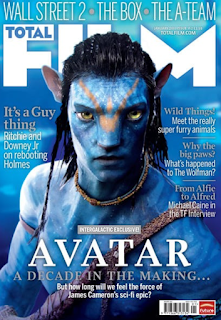
A magazine cover, simply put, is the front cover of a magazine. All magazines will have a front cover, so the magazine itself can be identified. Magazine front covers will also be used to give people an idea of what will be inside the magazine, such as what stories will be covered and the topics that the magazine includes.
Magazine covers will usually be eye-catching so people are immediately drawn to the magazine and will want to buy it. Magazine covers will typically achieve this by being very colourful, having a memorable title, and by putting their most interesting stories on the front cover of the magazine to persuade people to read (through the cover lines and tag lines).
What are conventions of magazine covers?
A typical magazine cover will usually have the following conventions:
-A main image which dominates
-A masthead (the title within a header at the top of the page)
-Cover lines / tag lines (this is the main text on the cover which will give away the kind of stories that will be in the magazine)
-An array of eye-catching colours
-Strapline (an introductory headline below the masthead which describes an aspect of the magazine)
-Tagline
-Barcode, issue number and price
These conventions will all be typically found on magazine covers. They all serve a purpose in making the overall cover effective and memorable. For example, the masthead serves to attract a similar audience every-time and to bring in loyal readers, through having a masthead title which is memorable and distinctive. The tagline perhaps has this purpose as well.
The purpose of the cover lines / tag lines is to persuade people to read the magazine, as these lines will typically tell people what stories are inside the magazine. This will wet people's appetite if they think they will find the stories interesting, and thus they will be more inclined to buy the magazine.
The eye-catching array of colours serves to make the magazine cover stand out amongst others, so when people are browsing this is the magazine cover that they notice. As people will tend to browse through magazines in an environment such as a shop before they buy, then this should be an important convention of a magazine.
Subscribe to:
Posts (Atom)