Tuesday, 28 March 2017

Final idea: Magazine cover


Final choice on outline

My final decision was to go with picture 1, as previously stated. With the overall layout of the magazine cover I have decided to stick most closely to the cover of "Sight & Sound." This is because this a more low-key, less clustered magazine, which I feel will help my magazine cover and make it seem more authentic (as opposed to trying to mimic a cover of a  best selling magazine).
I am going to use most of the conventions that are typically found on magazine covers, such as the coverlines, the strapline and the masthead. This, again, is to make the magazine cover seem as authentic as possible.

Tuesday, 14 March 2017

Planning magazine cover: Initial ideas

Conventions that I will use

For my own magazine cover, I will make use of some of the main magazine cover conventions. This will include a main image, a masthead, cover lines, strapline, and barcode/issue number. Like the poster, I want to stick to these conventions as best I can to make the movie poster as realistic as possible, and to make it seem realistic. Despite sticking to these main conventions, I will try not to have too many coverlines to avoid the magazine cover seeming too clustered. This is to show that the magazine is not a widely marketed one and is instead a smaller, independent film magazine, which I want to convey in my cover.


Initial ideas

I want my magazine cover to again depict the villain, so the genre can be easily identified again. I am considering using picture 1 this time, as I feel it will be appropriate for a magazine cover, as, like the second picture, it presents the villain as threatening and menacing (reinforced this time by the gun in his hands). The picture will be eye-catching, which will conform to the convention of a main image which dominates that most magazine covers have. It will also conform to the convention of an eye-catching array of colours, with the red snout contrasting with the brown behind the villain and the yellowness of the mask. I will potentially use the outline of the villain and place it onto the magazine cover instead of having the background visible. I think this might make the magazine cover look more sinister, as the only image available will be that of the villain with the gun, and as such the audience are likely to pay more attention to it and recognise that the magazine cover is promoting a horror movie.


(Final picture for magazine cover)


Monday, 6 March 2017

Ancillary products: What is a magazine cover?

What is a magazine cover?

A magazine cover, simply put, is the front cover of a magazine. All magazines will have a front cover, so the magazine itself can be identified. Magazine front covers will also be used to give people an idea of what will be inside the magazine, such as what stories will be covered and the topics that the magazine includes.

Magazine covers will usually be eye-catching so people are immediately drawn to the magazine and will want to buy it. Magazine covers will typically achieve this by being very colourful, having a memorable title, and by putting their most interesting stories on the front cover of the magazine to persuade people to read (through the cover lines and tag lines).


What are conventions of magazine covers?

A typical magazine cover will usually have the following conventions:

-A main image which dominates
-A masthead (the title within a header at the top of the page)
-Cover lines / tag lines (this is the main text on the cover which will give away the kind of stories that will be in the magazine)
-An array of eye-catching colours
-Strapline (an introductory headline below the masthead which describes an aspect of the magazine)
-Tagline
-Barcode, issue number and price


These conventions will all be typically found on magazine covers. They all serve a purpose in making the overall cover effective and memorable. For example, the masthead serves to attract a similar audience every-time and to bring in loyal readers, through having a masthead title which is memorable and distinctive. The tagline perhaps has this purpose as well.

The purpose of the cover lines / tag lines is to persuade people to read the magazine, as these lines will typically tell people what stories are inside the magazine. This will wet people's appetite if they think they will find the stories interesting, and thus they will be more inclined to buy the magazine.

The eye-catching array of colours serves to make the magazine cover stand out amongst others, so when people are browsing this is the magazine cover that they notice. As people will tend to browse through magazines in an environment such as a shop before they buy, then this should be an important convention of a magazine.


Monday, 20 February 2017

Final idea: Film poster

Final choice on picture
My final choice on picture is picture 2. This is the image where the villain is looking straight at the camera in an outdoor environment, where trees can be seen in the background. I feel this is the most suitable picture to use as there is enough space for the text to be seen to the side of the villain, and to fit comfortably next to image itself. I also feel the villain looks very menacing in this picture, more so than in the third picture, despite the villain carrying no visible weapon within this image. Below, I have analysed the picture and stated where certain things will be placed.


Within my poster outline I have referred to the poster format, which can also be seen above. This is most noticeable with the placing of the tagline, the production info and the release date on the poster. These will be placed at the bottom below the main image, as can also be seen within the poster format grid.


Final choice on colours
For my final poster I have decided to use the colours red and black. The redness will be seen in the movie title (the title will be the same colour and font as it is in the trailer) and also surrounding the text used for the director/writer and the actors (where the text will be black). The surrounding colour scheme of the picture will be black, but there will also be hints of red which will surround the villain's costume (which is black and grey). This means, along with the yellowness of the pig mask, the poster will contain red, black and yellow highlights. I think the predominant red and black colours will be effective as they connote danger and evilness. I also think the yellowness of the pig mask will be effective in making the mask eye catching as the colour will stand out against the red and black, as well as establishing to the audience that the mask does indeed resemble that of a pig.

Sunday, 19 February 2017

Planning film poster: Initial ideas

Conventions that I will use

For my own movie poster, I am going to try and stick to the main movie poster conventions as best I can. As established in my previous research, these main conventions include having a picture (preferably a photograph of one of the main characters), having the title of the film on the poster in large letters, having information such as who the main actors are and who wrote/directed it, and having an array of eye-catching colours. I want to stick to these conventions to make my movie poster as realistic as possible.


Initial ideas on main photograph/picture

I want my main picture to make the film's genre immediately identifiable, and to also paint a picture of what the film is about. As such, I want the picture to feature the antagonist of the trailer; the villain with the pig mask. When people see the poster the first thing they will see is a frightening looking masked villain, and as such most people will immediately be able to identify the poster as belonging to the horror genre. I have three pictures of the villain which I am considering as the main photograph of the poster. These three pictures all present the villain as threatening, and I feel all three give off the right atmosphere which fits with my trailer. I have gone into separate analysis on all three:

Picture 1


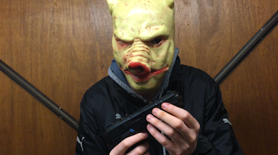
This picture is a medium shot of the villain directly facing the camera, holding his weapon in both hands. I think the image is threatening as it instantly shows that the villain is dangerous and is probably evil (as he is holding a gun.) You can also clearly see his costume (black clothing), which further enforces the sense of evilness that this character should give off. I also think the background is strong, as it too is dark and also strangely ambivalent (it is in fact a garage door). The redness of the pig mask contrasts with the otherwise dark coloring, making the overall colour scheme eye-catching. Overall, I think this is a strong image as it immediately gives away the genre of the film, and is unsettling and eye catching.


Picture 2


This picture again depicts the villain, this time in an outdoor environment. Unlike the last picture, he has his hood up and is not center frame, making the image somewhat more disorientating. This may be a good thing, as it may make the image seem more ominous to some people. I feel the villain again looks threatening, however not as threatening as the first picture, as this time no weapons can be seen in his possession. This makes him look less intimidating. I think the background is strong however, as eerie looking tress can be seen which I feel fits with the genre. Overall, I think this is again a strong image and will immediately identify the genre for many people, however it can be argued that the villain does not give off as much of a evil persona as in the first image.


Picture 3


The final idea that I have for my main poster image is a picture which again depicts the villain, who this time is looking away from the camera and is aiming his gun at something. The background is the same as in the first picture, which is a positive trait as I identified this as a strong background within my analysis of the first image. He is also holding his weapon again, unlike in the second image. This is also a positive thing as it identifies him as being evil and threatening. However, I think a disadvantage to this image is that we can not see the villain as clearly, as he is not facing the camera. Instead, we only get a side-view of him, and as such the image may not be as eye-catching/scary as the villain is less noticeable. I think the strong colour scheme that I identified for the first picture can again be seen here though, and I think overall this would be a strong image to use as it is frightening and immediately depicts the genre as horror.


Colour scheme that I will use in the poster

An eye-catching array of colours is an integral convention of movie posters, and as such is something I should try and make strong use of within my own movie poster. I want to make strong use of the colour red, as this colour connotes danger and horror, and many will associate it with blood. However, as the title of the my film is in a red colour, I cannot make the surrounding colours all red, as my title would not stand out much. Therefore, I think I will make a strong use of the colour black as well. This colour is a very negative colour, and matches the outfit of the villain. Making strong use of it would tell viewers of the poster that this film belongs somewhat to the horror genre, however the title of the film will also tell people that the genre has comedy elements to it as well, to avoid any possible confusion.