For my own movie poster, I am going to try and stick to the main movie poster conventions as best I can. As established in my previous research, these main conventions include having a picture (preferably a photograph of one of the main characters), having the title of the film on the poster in large letters, having information such as who the main actors are and who wrote/directed it, and having an array of eye-catching colours. I want to stick to these conventions to make my movie poster as realistic as possible.
Initial ideas on main photograph/picture
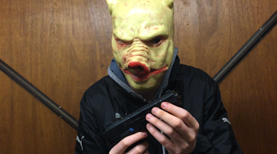
I want my main picture to make the film's genre immediately identifiable, and to also paint a picture of what the film is about. As such, I want the picture to feature the antagonist of the trailer; the villain with the pig mask. When people see the poster the first thing they will see is a frightening looking masked villain, and as such most people will immediately be able to identify the poster as belonging to the horror genre. I have three pictures of the villain which I am considering as the main photograph of the poster. These three pictures all present the villain as threatening, and I feel all three give off the right atmosphere which fits with my trailer. I have gone into separate analysis on all three:
Picture 1

This picture is a medium shot of the villain directly facing the camera, holding his weapon in both hands. I think the image is threatening as it instantly shows that the villain is dangerous and is probably evil (as he is holding a gun.) You can also clearly see his costume (black clothing), which further enforces the sense of evilness that this character should give off. I also think the background is strong, as it too is dark and also strangely ambivalent (it is in fact a garage door). The redness of the pig mask contrasts with the otherwise dark coloring, making the overall colour scheme eye-catching. Overall, I think this is a strong image as it immediately gives away the genre of the film, and is unsettling and eye catching.
Picture 2

This picture again depicts the villain, this time in an outdoor environment. Unlike the last picture, he has his hood up and is not center frame, making the image somewhat more disorientating. This may be a good thing, as it may make the image seem more ominous to some people. I feel the villain again looks threatening, however not as threatening as the first picture, as this time no weapons can be seen in his possession. This makes him look less intimidating. I think the background is strong however, as eerie looking tress can be seen which I feel fits with the genre. Overall, I think this is again a strong image and will immediately identify the genre for many people, however it can be argued that the villain does not give off as much of a evil persona as in the first image.
Picture 3

The final idea that I have for my main poster image is a picture which again depicts the villain, who this time is looking away from the camera and is aiming his gun at something. The background is the same as in the first picture, which is a positive trait as I identified this as a strong background within my analysis of the first image. He is also holding his weapon again, unlike in the second image. This is also a positive thing as it identifies him as being evil and threatening. However, I think a disadvantage to this image is that we can not see the villain as clearly, as he is not facing the camera. Instead, we only get a side-view of him, and as such the image may not be as eye-catching/scary as the villain is less noticeable. I think the strong colour scheme that I identified for the first picture can again be seen here though, and I think overall this would be a strong image to use as it is frightening and immediately depicts the genre as horror.
Colour scheme that I will use in the poster
An eye-catching array of colours is an integral convention of movie posters, and as such is something I should try and make strong use of within my own movie poster. I want to make strong use of the colour red, as this colour connotes danger and horror, and many will associate it with blood. However, as the title of the my film is in a red colour, I cannot make the surrounding colours all red, as my title would not stand out much. Therefore, I think I will make a strong use of the colour black as well. This colour is a very negative colour, and matches the outfit of the villain. Making strong use of it would tell viewers of the poster that this film belongs somewhat to the horror genre, however the title of the film will also tell people that the genre has comedy elements to it as well, to avoid any possible confusion.
No comments:
Post a Comment