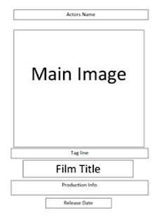
My final choice on picture is picture 2. This is the image where the villain is looking straight at the camera in an outdoor environment, where trees can be seen in the background. I feel this is the most suitable picture to use as there is enough space for the text to be seen to the side of the villain, and to fit comfortably next to image itself. I also feel the villain looks very menacing in this picture, more so than in the third picture, despite the villain carrying no visible weapon within this image. Below, I have analysed the picture and stated where certain things will be placed.


Within my poster outline I have referred to the poster format, which can also be seen above. This is most noticeable with the placing of the tagline, the production info and the release date on the poster. These will be placed at the bottom below the main image, as can also be seen within the poster format grid.
Final choice on colours
For my final poster I have decided to use the colours red and black. The redness will be seen in the movie title (the title will be the same colour and font as it is in the trailer) and also surrounding the text used for the director/writer and the actors (where the text will be black). The surrounding colour scheme of the picture will be black, but there will also be hints of red which will surround the villain's costume (which is black and grey). This means, along with the yellowness of the pig mask, the poster will contain red, black and yellow highlights. I think the predominant red and black colours will be effective as they connote danger and evilness. I also think the yellowness of the pig mask will be effective in making the mask eye catching as the colour will stand out against the red and black, as well as establishing to the audience that the mask does indeed resemble that of a pig.
No comments:
Post a Comment