The editing software that I have used in order to edit my trailer is Premier Pro. I used this software last year, however this year I feel I have a better understanding of how to use and navigate the software, and as such I think I am able to make better use out of it.
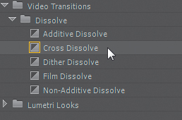
I have used a number of techniques that can be found on the platform including the additive dissolve, the black and white feature, the opacity feature, the cross dissolve and the video reverse. These have all helped in ultimately making the trailer effective.

Difficulties I have faced
During the editing process, I have faced a number of difficulties. Firstly, I have struggled with my shot selection. Some of the shots, due to location, were blurry and as a result could not be used in their raw state within the trailer.
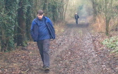
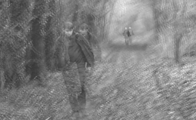
In this particular shot, due to the rather shaded location, there was not much visibility and thus the quality was bad. I tackled this however by making the shot black and white and by adding the opacity effect to the shot, which not only makes the fuzziness less noticeable (as the opacity distracts from the quality), but also makes the shot look better and more frightening / disorientating. I feel this was an effective piece of editing, as I took a shot that was not particularly strong and transformed it into, in my opinion, an effective and very suitable shot which helps to build suspense.
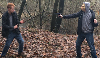
A second difficulty that I faced was deciding which order to place the shots in. This was particularly prominent within the montage editing section of the trailer. It took me quite a while to get the order of the shots right, so it synced with the music and looked smooth and fitting. I had to replace one shot (a shot of one of the victims fighting the villain with a stick) with a shot of running feet, as I felt the latter to be more dramatic and also fitting.
Original shot: Replacement shot:

A third difficulty I have faced is the title itself. I have struggled with choosing a font for the title, as well as a correct colour scheme for it. At present, I am still unsure what my finished title will look like, and I am still investigating possible fonts to use. Below outline some of the fonts I have considered, the bottom one being the font I used in the rough cut.


(Trattatello - final font)

Complete
ReplyDelete