Saturday, 29 April 2017
Friday, 28 April 2017
Thursday, 27 April 2017
Wednesday, 26 April 2017
Evaluation question 4
How did you use media technologies in the construction and research, planning and evaluation stages?
Since AS my skills in the use of digital technology, and the media technologies that I have used, have changed considerably. Media technologies that I used at A2 but not at AS include the video recording software "Ezvid," SlideShare, Meta-Chart, Bubbl.us and the screenshot feature on the Mac.
These media technologies have allowed me to project my research, planning and evaluation on a range of different mediums, meaning I have exploited the media more and used a variety of different methods in order to show each stage of the process. I feel this has helped me in every stage of the process, and has made my blog as a whole more coherent and well structured. For example, at AS I used a rough tally to communicate the results of my audience feedback. At A2 however, I put the results from my audience questionnaires onto a bar chart, meaning the results of the feedback were ultimately easier to analyse and form a conclusion from.
(AS)
(A2)
During A2, the numerous different media technologies that I have used have helped me in the pre-production, production, editing and distribution stages. For example, using the screenshot feature on the Mac has allowed me to outline areas of pre-production, such as my storyboards and call sheets, as well as areas of production and editing, such as post-production editing where I took screenshots of various stages in my editing process.
During A2 I have also made quite a bit of use of YouTube. For example, I have uploaded a casting video, an audience feedback video and two videos for my evaluations onto the platform, in order to add visual information and to help document various stages of the process.
In the spider diagrams below, I have gone into more detail on all the media technologies that I have used, and the strengths and weaknesses of using them.
Overall, I believe that these media technologies were all instrumental in making my final products a success, as they all helped in one way or another. The planning, production and evaluation stages all exploited these various media technologies, meaning my final blog uses a lot of visual information as well as text. The outcome of using these various technologies, I feel, is a blog that includes lots of written detail, through the mediums of SlideShare and PowerPoint, and also lots of visual information, such as Ezvid and Mega-Chart, meaning my blog makes use of a variety of different mediums to present information.
Monday, 24 April 2017
Evaluation question 3
What have you learnt from your audience feedback?
Audience feedback is an important part of the production process as it allows for different opinions and viewpoints on how your production plays out. Having a range of different perspectives is helpful as it gives you as the film-maker an insight into how other people perceive your product and what they like/dislike about it. Without this audience feedback, the film-maker may not notice mistakes or they may perceive things as being better than they actually are, which is why audience feedback is important in order to overcome these things.
When conducting the audience feedback I considered Stuart Hall's reception theory. This theory states that the audience will read texts differently, and will either conform to the preferred reading, the negotiated reading or the oppositional reading of a text. When conducting my questionnaires and interview, I considered these different options. For example, with my first survey question where I ask what the costume of my villain should be, I had a preferred reading (the pig mask), a negotiated reading (the wolf mask), and an oppositional reading (not having a mask.) After telling the people who were taking the questionnaire what the plot of the trailer was and what would happen, as well as showing them the locations and a couple of test shots, they "read," what they saw, so to speak, and decided whether they agreed with my ideas or not. I therefore feel that the reception theory can be applied to this questionnaire.
With the video below, I have outlined the results of my questionnaires, while also going into detail on the interview I did with another student, and the outcomes of both the interview and the questionaires on my product.
Thursday, 20 April 2017
Evaluation question 2
How effective is the combination of your main product and ancillary texts?
The promotion and marketing of a film is very important in order for the film to be successful. If a film has good marketing and is promoted well and on a variety of mediums, then it is more likely to be viewed and therefore more likely to be successful. This is why the combination of main products with ancillary texts is such an important topic, as the synergy across the mediums can determine whether the film will be a success or not.
Looking at the Uses and Gratification theory, there are four reasons why an audience member might decide to watch a film (education, personal identity, entertainment, social interaction). In order for an ancillary product to be effective, it must tell a viewer that it conforms to one of these four categories, otherwise the viewer would have no reason to go ahead and watch the film. I feel my personal ancillary products conform to the "entertainment" category of the theory, as my main product is a horror trailer and thus has a purpose to make people feel frightened and conform to their visceral pleasures. In the video below I explore how I think my ancillary products are effective and how they work with the main product in order to appeal to a potential audience.
Wednesday, 19 April 2017
Evaluation question 1
In what ways does your media products use, develop or challenge forms and conventions of real media products?
For the purpose of this question, I am going to be referring to the trailers for Shaun of the Dead and Scary Movie, both popular films within the comedy-horror genre. Both trailers have a lot of views on YouTube, proving that they are popular films. I therefore think that they are good examples to use as they are representative of the comedy-horror genre as a whole.
Conventions of comedy-horror trailers:
-An establishing shot
-Montage editing
-Wide angle shots
-Sections of the trailer being strictly comedy or horror based
-A horror based font
-Gallows humour
How have I challenged conventions?
Despite making use of most of the conventions above, I have also challenged some of the conventions to both make my product more unique and also to change the direction of the genre. Nicholas Abercrombie says, "audience may enjoy the stretching of a genre in new directions." I found inspiration in this quote and decided to apply it to my project, deciding that a change in genre would bring positive results to my trailer.
A notable change in my trailer compared to the real-life comedy-horror trailers is more emphasis on the horror aspect within my trailer. Even though comedy elements are seen at the start, the predominant atmosphere throughout the trailer is that of a frightening, creepy one. This is for reasons such as me wanting to change the direction of the genre, as previously identified, as well as a natural change that resulted in shots and dialogue that connoted a more serious atmosphere to the one I had originally been anticipating.
Another convention I have broken is the use of gallows humour within the trailer. This is because the scenes that contain violence, such as the scene when one of the victims is tied up by the villain, is not meant to be funny and thus there is no humour to be found from violent elements of the media, despite there being humour elsewhere. This means, technically, there is no gallows humour within my trailer.
Tuesday, 28 March 2017
Final idea: Magazine cover
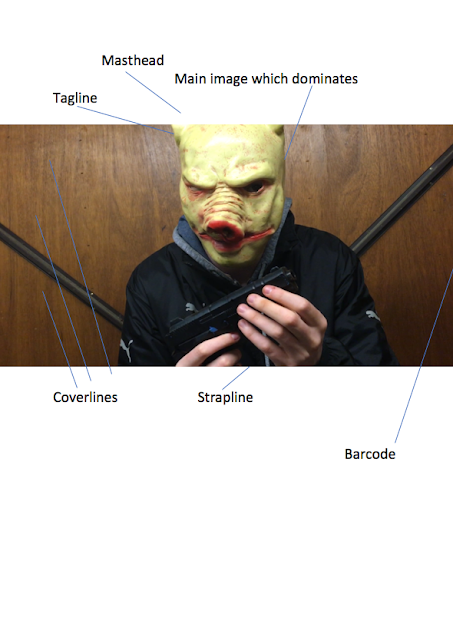
Final choice on outline
My final decision was to go with picture 1, as previously stated. With the overall layout of the magazine cover I have decided to stick most closely to the cover of "Sight & Sound." This is because this a more low-key, less clustered magazine, which I feel will help my magazine cover and make it seem more authentic (as opposed to trying to mimic a cover of a best selling magazine).
I am going to use most of the conventions that are typically found on magazine covers, such as the coverlines, the strapline and the masthead. This, again, is to make the magazine cover seem as authentic as possible.
Tuesday, 14 March 2017
Planning magazine cover: Initial ideas
Conventions that I will use
For my own magazine cover, I will make use of some of the main magazine cover conventions. This will include a main image, a masthead, cover lines, strapline, and barcode/issue number. Like the poster, I want to stick to these conventions as best I can to make the movie poster as realistic as possible, and to make it seem realistic. Despite sticking to these main conventions, I will try not to have too many coverlines to avoid the magazine cover seeming too clustered. This is to show that the magazine is not a widely marketed one and is instead a smaller, independent film magazine, which I want to convey in my cover.
Initial ideas
I want my magazine cover to again depict the villain, so the genre can be easily identified again. I am considering using picture 1 this time, as I feel it will be appropriate for a magazine cover, as, like the second picture, it presents the villain as threatening and menacing (reinforced this time by the gun in his hands). The picture will be eye-catching, which will conform to the convention of a main image which dominates that most magazine covers have. It will also conform to the convention of an eye-catching array of colours, with the red snout contrasting with the brown behind the villain and the yellowness of the mask. I will potentially use the outline of the villain and place it onto the magazine cover instead of having the background visible. I think this might make the magazine cover look more sinister, as the only image available will be that of the villain with the gun, and as such the audience are likely to pay more attention to it and recognise that the magazine cover is promoting a horror movie.
(Final picture for magazine cover)
Monday, 13 March 2017
Monday, 6 March 2017
Ancillary products: What is a magazine cover?
What is a magazine cover?
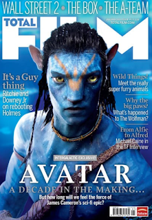
A magazine cover, simply put, is the front cover of a magazine. All magazines will have a front cover, so the magazine itself can be identified. Magazine front covers will also be used to give people an idea of what will be inside the magazine, such as what stories will be covered and the topics that the magazine includes.
Magazine covers will usually be eye-catching so people are immediately drawn to the magazine and will want to buy it. Magazine covers will typically achieve this by being very colourful, having a memorable title, and by putting their most interesting stories on the front cover of the magazine to persuade people to read (through the cover lines and tag lines).
What are conventions of magazine covers?
A typical magazine cover will usually have the following conventions:
-A main image which dominates
-A masthead (the title within a header at the top of the page)
-Cover lines / tag lines (this is the main text on the cover which will give away the kind of stories that will be in the magazine)
-An array of eye-catching colours
-Strapline (an introductory headline below the masthead which describes an aspect of the magazine)
-Tagline
-Barcode, issue number and price
These conventions will all be typically found on magazine covers. They all serve a purpose in making the overall cover effective and memorable. For example, the masthead serves to attract a similar audience every-time and to bring in loyal readers, through having a masthead title which is memorable and distinctive. The tagline perhaps has this purpose as well.
The purpose of the cover lines / tag lines is to persuade people to read the magazine, as these lines will typically tell people what stories are inside the magazine. This will wet people's appetite if they think they will find the stories interesting, and thus they will be more inclined to buy the magazine.
The eye-catching array of colours serves to make the magazine cover stand out amongst others, so when people are browsing this is the magazine cover that they notice. As people will tend to browse through magazines in an environment such as a shop before they buy, then this should be an important convention of a magazine.

Monday, 20 February 2017
Final idea: Film poster
Final choice on picture
My final choice on picture is picture 2. This is the image where the villain is looking straight at the camera in an outdoor environment, where trees can be seen in the background. I feel this is the most suitable picture to use as there is enough space for the text to be seen to the side of the villain, and to fit comfortably next to image itself. I also feel the villain looks very menacing in this picture, more so than in the third picture, despite the villain carrying no visible weapon within this image. Below, I have analysed the picture and stated where certain things will be placed.

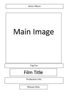
Within my poster outline I have referred to the poster format, which can also be seen above. This is most noticeable with the placing of the tagline, the production info and the release date on the poster. These will be placed at the bottom below the main image, as can also be seen within the poster format grid.
Final choice on colours
For my final poster I have decided to use the colours red and black. The redness will be seen in the movie title (the title will be the same colour and font as it is in the trailer) and also surrounding the text used for the director/writer and the actors (where the text will be black). The surrounding colour scheme of the picture will be black, but there will also be hints of red which will surround the villain's costume (which is black and grey). This means, along with the yellowness of the pig mask, the poster will contain red, black and yellow highlights. I think the predominant red and black colours will be effective as they connote danger and evilness. I also think the yellowness of the pig mask will be effective in making the mask eye catching as the colour will stand out against the red and black, as well as establishing to the audience that the mask does indeed resemble that of a pig.
My final choice on picture is picture 2. This is the image where the villain is looking straight at the camera in an outdoor environment, where trees can be seen in the background. I feel this is the most suitable picture to use as there is enough space for the text to be seen to the side of the villain, and to fit comfortably next to image itself. I also feel the villain looks very menacing in this picture, more so than in the third picture, despite the villain carrying no visible weapon within this image. Below, I have analysed the picture and stated where certain things will be placed.


Within my poster outline I have referred to the poster format, which can also be seen above. This is most noticeable with the placing of the tagline, the production info and the release date on the poster. These will be placed at the bottom below the main image, as can also be seen within the poster format grid.
Final choice on colours
For my final poster I have decided to use the colours red and black. The redness will be seen in the movie title (the title will be the same colour and font as it is in the trailer) and also surrounding the text used for the director/writer and the actors (where the text will be black). The surrounding colour scheme of the picture will be black, but there will also be hints of red which will surround the villain's costume (which is black and grey). This means, along with the yellowness of the pig mask, the poster will contain red, black and yellow highlights. I think the predominant red and black colours will be effective as they connote danger and evilness. I also think the yellowness of the pig mask will be effective in making the mask eye catching as the colour will stand out against the red and black, as well as establishing to the audience that the mask does indeed resemble that of a pig.
Sunday, 19 February 2017
Planning film poster: Initial ideas
Conventions that I will use
For my own movie poster, I am going to try and stick to the main movie poster conventions as best I can. As established in my previous research, these main conventions include having a picture (preferably a photograph of one of the main characters), having the title of the film on the poster in large letters, having information such as who the main actors are and who wrote/directed it, and having an array of eye-catching colours. I want to stick to these conventions to make my movie poster as realistic as possible.
Initial ideas on main photograph/picture
I want my main picture to make the film's genre immediately identifiable, and to also paint a picture of what the film is about. As such, I want the picture to feature the antagonist of the trailer; the villain with the pig mask. When people see the poster the first thing they will see is a frightening looking masked villain, and as such most people will immediately be able to identify the poster as belonging to the horror genre. I have three pictures of the villain which I am considering as the main photograph of the poster. These three pictures all present the villain as threatening, and I feel all three give off the right atmosphere which fits with my trailer. I have gone into separate analysis on all three:
Picture 1
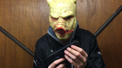
This picture is a medium shot of the villain directly facing the camera, holding his weapon in both hands. I think the image is threatening as it instantly shows that the villain is dangerous and is probably evil (as he is holding a gun.) You can also clearly see his costume (black clothing), which further enforces the sense of evilness that this character should give off. I also think the background is strong, as it too is dark and also strangely ambivalent (it is in fact a garage door). The redness of the pig mask contrasts with the otherwise dark coloring, making the overall colour scheme eye-catching. Overall, I think this is a strong image as it immediately gives away the genre of the film, and is unsettling and eye catching.
Picture 2
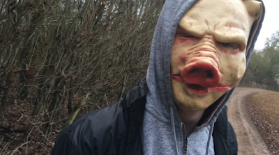
This picture again depicts the villain, this time in an outdoor environment. Unlike the last picture, he has his hood up and is not center frame, making the image somewhat more disorientating. This may be a good thing, as it may make the image seem more ominous to some people. I feel the villain again looks threatening, however not as threatening as the first picture, as this time no weapons can be seen in his possession. This makes him look less intimidating. I think the background is strong however, as eerie looking tress can be seen which I feel fits with the genre. Overall, I think this is again a strong image and will immediately identify the genre for many people, however it can be argued that the villain does not give off as much of a evil persona as in the first image.
Picture 3

The final idea that I have for my main poster image is a picture which again depicts the villain, who this time is looking away from the camera and is aiming his gun at something. The background is the same as in the first picture, which is a positive trait as I identified this as a strong background within my analysis of the first image. He is also holding his weapon again, unlike in the second image. This is also a positive thing as it identifies him as being evil and threatening. However, I think a disadvantage to this image is that we can not see the villain as clearly, as he is not facing the camera. Instead, we only get a side-view of him, and as such the image may not be as eye-catching/scary as the villain is less noticeable. I think the strong colour scheme that I identified for the first picture can again be seen here though, and I think overall this would be a strong image to use as it is frightening and immediately depicts the genre as horror.
Colour scheme that I will use in the poster
An eye-catching array of colours is an integral convention of movie posters, and as such is something I should try and make strong use of within my own movie poster. I want to make strong use of the colour red, as this colour connotes danger and horror, and many will associate it with blood. However, as the title of the my film is in a red colour, I cannot make the surrounding colours all red, as my title would not stand out much. Therefore, I think I will make a strong use of the colour black as well. This colour is a very negative colour, and matches the outfit of the villain. Making strong use of it would tell viewers of the poster that this film belongs somewhat to the horror genre, however the title of the film will also tell people that the genre has comedy elements to it as well, to avoid any possible confusion.
For my own movie poster, I am going to try and stick to the main movie poster conventions as best I can. As established in my previous research, these main conventions include having a picture (preferably a photograph of one of the main characters), having the title of the film on the poster in large letters, having information such as who the main actors are and who wrote/directed it, and having an array of eye-catching colours. I want to stick to these conventions to make my movie poster as realistic as possible.
Initial ideas on main photograph/picture
I want my main picture to make the film's genre immediately identifiable, and to also paint a picture of what the film is about. As such, I want the picture to feature the antagonist of the trailer; the villain with the pig mask. When people see the poster the first thing they will see is a frightening looking masked villain, and as such most people will immediately be able to identify the poster as belonging to the horror genre. I have three pictures of the villain which I am considering as the main photograph of the poster. These three pictures all present the villain as threatening, and I feel all three give off the right atmosphere which fits with my trailer. I have gone into separate analysis on all three:
Picture 1

This picture is a medium shot of the villain directly facing the camera, holding his weapon in both hands. I think the image is threatening as it instantly shows that the villain is dangerous and is probably evil (as he is holding a gun.) You can also clearly see his costume (black clothing), which further enforces the sense of evilness that this character should give off. I also think the background is strong, as it too is dark and also strangely ambivalent (it is in fact a garage door). The redness of the pig mask contrasts with the otherwise dark coloring, making the overall colour scheme eye-catching. Overall, I think this is a strong image as it immediately gives away the genre of the film, and is unsettling and eye catching.
Picture 2

This picture again depicts the villain, this time in an outdoor environment. Unlike the last picture, he has his hood up and is not center frame, making the image somewhat more disorientating. This may be a good thing, as it may make the image seem more ominous to some people. I feel the villain again looks threatening, however not as threatening as the first picture, as this time no weapons can be seen in his possession. This makes him look less intimidating. I think the background is strong however, as eerie looking tress can be seen which I feel fits with the genre. Overall, I think this is again a strong image and will immediately identify the genre for many people, however it can be argued that the villain does not give off as much of a evil persona as in the first image.
Picture 3

The final idea that I have for my main poster image is a picture which again depicts the villain, who this time is looking away from the camera and is aiming his gun at something. The background is the same as in the first picture, which is a positive trait as I identified this as a strong background within my analysis of the first image. He is also holding his weapon again, unlike in the second image. This is also a positive thing as it identifies him as being evil and threatening. However, I think a disadvantage to this image is that we can not see the villain as clearly, as he is not facing the camera. Instead, we only get a side-view of him, and as such the image may not be as eye-catching/scary as the villain is less noticeable. I think the strong colour scheme that I identified for the first picture can again be seen here though, and I think overall this would be a strong image to use as it is frightening and immediately depicts the genre as horror.
Colour scheme that I will use in the poster
An eye-catching array of colours is an integral convention of movie posters, and as such is something I should try and make strong use of within my own movie poster. I want to make strong use of the colour red, as this colour connotes danger and horror, and many will associate it with blood. However, as the title of the my film is in a red colour, I cannot make the surrounding colours all red, as my title would not stand out much. Therefore, I think I will make a strong use of the colour black as well. This colour is a very negative colour, and matches the outfit of the villain. Making strong use of it would tell viewers of the poster that this film belongs somewhat to the horror genre, however the title of the film will also tell people that the genre has comedy elements to it as well, to avoid any possible confusion.
Friday, 10 February 2017
Thursday, 9 February 2017
Tuesday, 7 February 2017
Ancillary products: What is a film poster?
What is a film poster?
Simply put, a film poster is a poster used to promote and advertise a film. A studio will often print various different posters for the same media, so the film can be advertised more globally and can potentially gain more publicity.
Film posters tend to be shown in environments such as movie theatres, busy streets and shops, and will often be placed on billboards. They will typically be shown in an area where they are likely to be seen and identified by many. An example of such an environment would be at the side of a busy road, where hundreds of people will pass everyday. Film producers and advertisers see the masses as passing trade, and as such will try and place their movie posters in some of the busiest places that they can in order to gain publicity.
What are conventions of film posters?
Film posters have various conventions which most of them follow in order to be effective. The first common convention is having a picture with text. The text will typically give the title of the movie, as well as details such as who the main actors are and who wrote it/directed it. Another convention, typically of contemporary movie posters, is a photograph of the main actors. This contrasts with old movie posters, which typically used illustrations, instead of photographs.
A third convention is having the film title on the film poster in large letters, as well as the main actors. The writer / director, the names of the characters and the release date will also be included on a poster as well.
A fourth and final convention of movie posters is an array of eye-catching colours, in order to attract attention. As I mentioned previously, movie posters will often be placed in busy places to attract attention. For this reason, they have to attract attention by using colours that will catch the eye of many, and as such the majority of film posters will use this technique.

Monday, 6 February 2017
Post production: Changes
How will I improve?
After the audience testing and my own new ideas and discoveries, I am going to make a few small changes to the trailer which I feel will be beneficial in making it an overall stronger product. The most significant change I will make is changing how the title looks in the trailer. After the comment in the audience testing session that my title should be improved, I thought about it and came to the conclusion that my title should definitely be changed in order to make it more effective and distinctive. I will either add a blood effect / pig effects to the title to make it look more frightening (as discussed in audience testing), or I will experiment with different fonts and colours within the title to make it look more interesting. I will make sure that the finished title is, overall, more distinctive and memorable, which will not only help my trailer but also my poster and magazine cover.
Another change I will make is the change concerning the participant's observation of a slightly repetitive end to the trailer. As a result of this comment, I am going to change the very last shot, to avoid it being used twice. This will make for a more exciting final shot in my opinion, as well as obviously making the trailer less repetitive.
Concerning sound, I will try and make all the dialogue as loud as it can be, to ensure that it is consistent and that audience members can hear what the characters are saying without difficulty.
Audience testing
Summarising audience feedback
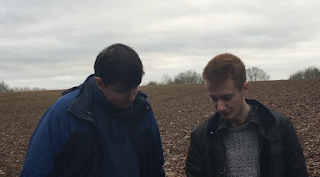
To gain feedback on the rough edit of my film, I conducted an audience feedback session with a fellow pupil to gain valuable information on how they perceived the media. This individual had never seen the trailer before, and so he is answering the questions with a fresh view on what the trailer contains. I asked him how he thought the editing could be improved, how the sound could be improved, and how the title could be improved. I also asked him what he liked about the trailer, in the hopes of formulating an overall opinion of how my trailer plays out.
The participant said that he liked certain shots and effects, such as the opacity effect that is used in a few of the shots. He liked the section where one of the opacity shot's dissolves into another shot of the villain closer to the camera, saying that he found this effective. He also said that the trailer interested him and that he found it convincing, stating that he would go and see this film.
Improvement wise, he said that there were a couple of shots where the dialogue is not as loud as it could be (I was already aware of this slight problem). He also said that he felt at the end the shots were a bit repetitive, and that too much was given away concerning the film's plot.
For the title, he said that more of the pig theme/horror theme could be exploited. For example, I could include a blood effect, or have pictures of pig ears or a pig snout within the title, presumably to make subject-content clearer.
Overall, his comments were positive, and he offered constructive criticism which I feel will help me in my editing process.
Sunday, 5 February 2017
Post Production: Sound
Music choices
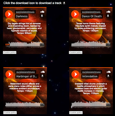
The tracks that I went for are "Darkness," and "Harbinger of Doom." The first track, "Darkness," was an appropriate choice because, even though it sounds uncanny, it is also strangely pleasant sounding and could definitely be viewed as being a comedy-horror track rather than just a horror track. This track contrasts strongly with the next one, "Harbinger of Doom," which is purely horror based. This is appropriate, as when the track "Darkness," finishes the trailer is supposed to be predominantly horror based, rather than the mix of horror and comedy that could be seen before. Overall, I think the music choices were good ones, as I feel they really help to convey the genres which they should be portraying.
I got the songs from "Purple Planet Royalty Free Music," which offers royalty free tracks of high quality. Both of the tracks I selected could be found within the "horror" section on the website.
Sound effect choices
The sound effects that I have include a pig noise, a suspicious sounding laugh, a bird cooing, and a spooky drone sound when the antagonist's foot stomps down in front of the camera. I selected these sound effects because they all help to build atmosphere, and are all relevant to the overall narrative as well. For example, the sound of the bird cooing not only builds atmosphere and helps to identify mies-en-scene (an outdoor environment in the countryside), but is is also sinister and suggests that the villain will soon be seen. I also feel that the the pig sound effects that I used are effective, as they act as the villain's sound motif, and as such would be easily identified as belonging to the villain if it were a real film. This is a positive thing, as I feel the sound effect is creepy and clearly resembles that of a human making a pig noise.
Difficulties that I have faced
I have faced a number of difficulties with the sound. Perhaps the most significant difficulty I have faced is trouble with the dialogue corresponding correctly with the music. There were a couple of instances when I put the clips onto Premier Pro and, arbitrarily, the dialogue in the clips could not be heard properly. For this reason, I had to do some voice-overs of the same lines so that the dialogue could be heard again. The lines "Damn it, we're out of reception," and "If he attacks us, run into the woods because we can climb up a tree to hide," were dubbed respectively of the clip. In my opinion the finished result is subtle, however I initially worried that you would be able to tell that it was dubbed. This method was obviously more time consuming as well, as it took numerous attempts for me to deliver the line in the right tone.


A second difficulty that I faced was getting appropriate music for the trailer. I had to be careful with my music selections because the first section of the trailer is supposed to be heavily comedy-horror, instead of purely horror. For this reason, I had to find music which reflected this idea and had both comedy and horror elements within it. For the rest of the trailer, I had to find scary music which not only identified the genre as horror but that also fitted with the action on screen and would be suitable/ fitting for the montage editing. In the end however, as previously mentioned, I felt that my final choices for the music were successful, and clearly reflected the genres that they should be reflecting.
The tracks that I went for are "Darkness," and "Harbinger of Doom." The first track, "Darkness," was an appropriate choice because, even though it sounds uncanny, it is also strangely pleasant sounding and could definitely be viewed as being a comedy-horror track rather than just a horror track. This track contrasts strongly with the next one, "Harbinger of Doom," which is purely horror based. This is appropriate, as when the track "Darkness," finishes the trailer is supposed to be predominantly horror based, rather than the mix of horror and comedy that could be seen before. Overall, I think the music choices were good ones, as I feel they really help to convey the genres which they should be portraying.
I got the songs from "Purple Planet Royalty Free Music," which offers royalty free tracks of high quality. Both of the tracks I selected could be found within the "horror" section on the website.

Sound effect choices
The sound effects that I have include a pig noise, a suspicious sounding laugh, a bird cooing, and a spooky drone sound when the antagonist's foot stomps down in front of the camera. I selected these sound effects because they all help to build atmosphere, and are all relevant to the overall narrative as well. For example, the sound of the bird cooing not only builds atmosphere and helps to identify mies-en-scene (an outdoor environment in the countryside), but is is also sinister and suggests that the villain will soon be seen. I also feel that the the pig sound effects that I used are effective, as they act as the villain's sound motif, and as such would be easily identified as belonging to the villain if it were a real film. This is a positive thing, as I feel the sound effect is creepy and clearly resembles that of a human making a pig noise.
Difficulties that I have faced
I have faced a number of difficulties with the sound. Perhaps the most significant difficulty I have faced is trouble with the dialogue corresponding correctly with the music. There were a couple of instances when I put the clips onto Premier Pro and, arbitrarily, the dialogue in the clips could not be heard properly. For this reason, I had to do some voice-overs of the same lines so that the dialogue could be heard again. The lines "Damn it, we're out of reception," and "If he attacks us, run into the woods because we can climb up a tree to hide," were dubbed respectively of the clip. In my opinion the finished result is subtle, however I initially worried that you would be able to tell that it was dubbed. This method was obviously more time consuming as well, as it took numerous attempts for me to deliver the line in the right tone.


A second difficulty that I faced was getting appropriate music for the trailer. I had to be careful with my music selections because the first section of the trailer is supposed to be heavily comedy-horror, instead of purely horror. For this reason, I had to find music which reflected this idea and had both comedy and horror elements within it. For the rest of the trailer, I had to find scary music which not only identified the genre as horror but that also fitted with the action on screen and would be suitable/ fitting for the montage editing. In the end however, as previously mentioned, I felt that my final choices for the music were successful, and clearly reflected the genres that they should be reflecting.
Post Production: Editing
Software
The editing software that I have used in order to edit my trailer is Premier Pro. I used this software last year, however this year I feel I have a better understanding of how to use and navigate the software, and as such I think I am able to make better use out of it.
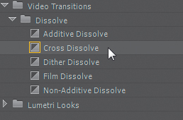
I have used a number of techniques that can be found on the platform including the additive dissolve, the black and white feature, the opacity feature, the cross dissolve and the video reverse. These have all helped in ultimately making the trailer effective.

Difficulties I have faced
During the editing process, I have faced a number of difficulties. Firstly, I have struggled with my shot selection. Some of the shots, due to location, were blurry and as a result could not be used in their raw state within the trailer.
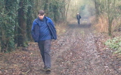
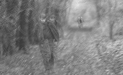
In this particular shot, due to the rather shaded location, there was not much visibility and thus the quality was bad. I tackled this however by making the shot black and white and by adding the opacity effect to the shot, which not only makes the fuzziness less noticeable (as the opacity distracts from the quality), but also makes the shot look better and more frightening / disorientating. I feel this was an effective piece of editing, as I took a shot that was not particularly strong and transformed it into, in my opinion, an effective and very suitable shot which helps to build suspense.
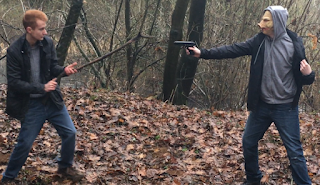
A second difficulty that I faced was deciding which order to place the shots in. This was particularly prominent within the montage editing section of the trailer. It took me quite a while to get the order of the shots right, so it synced with the music and looked smooth and fitting. I had to replace one shot (a shot of one of the victims fighting the villain with a stick) with a shot of running feet, as I felt the latter to be more dramatic and also fitting.
Original shot: Replacement shot:

A third difficulty I have faced is the title itself. I have struggled with choosing a font for the title, as well as a correct colour scheme for it. At present, I am still unsure what my finished title will look like, and I am still investigating possible fonts to use. Below outline some of the fonts I have considered, the bottom one being the font I used in the rough cut.


(Trattatello - final font)

The editing software that I have used in order to edit my trailer is Premier Pro. I used this software last year, however this year I feel I have a better understanding of how to use and navigate the software, and as such I think I am able to make better use out of it.
I have used a number of techniques that can be found on the platform including the additive dissolve, the black and white feature, the opacity feature, the cross dissolve and the video reverse. These have all helped in ultimately making the trailer effective.


Difficulties I have faced
During the editing process, I have faced a number of difficulties. Firstly, I have struggled with my shot selection. Some of the shots, due to location, were blurry and as a result could not be used in their raw state within the trailer.

In this particular shot, due to the rather shaded location, there was not much visibility and thus the quality was bad. I tackled this however by making the shot black and white and by adding the opacity effect to the shot, which not only makes the fuzziness less noticeable (as the opacity distracts from the quality), but also makes the shot look better and more frightening / disorientating. I feel this was an effective piece of editing, as I took a shot that was not particularly strong and transformed it into, in my opinion, an effective and very suitable shot which helps to build suspense.

A second difficulty that I faced was deciding which order to place the shots in. This was particularly prominent within the montage editing section of the trailer. It took me quite a while to get the order of the shots right, so it synced with the music and looked smooth and fitting. I had to replace one shot (a shot of one of the victims fighting the villain with a stick) with a shot of running feet, as I felt the latter to be more dramatic and also fitting.
Original shot: Replacement shot:


A third difficulty I have faced is the title itself. I have struggled with choosing a font for the title, as well as a correct colour scheme for it. At present, I am still unsure what my finished title will look like, and I am still investigating possible fonts to use. Below outline some of the fonts I have considered, the bottom one being the font I used in the rough cut.


(Trattatello - final font)
Subscribe to:
Comments (Atom)


